Recognised by The Knot Worldwide leadership for exceptional contribution to user-centred design, demonstrating through data and solutions how to prioritise the user experience in every product decision.
The role
Design System Lead is a hybrid role that sits at the intersection of design, strategy, and team leadership. Beyond defining visual language, the work spans architecture decisions, system prioritisation, cross-functional alignment across design, engineering, and product, and managing adoption across teams and platforms.
I lead a team of designers working on the system, balancing day-to-day execution with longer-term vision. I work hands-on in Figma while simultaneously handling governance, roadmap, and stakeholder communication. Just as important as building the system is making sure teams can use it confidently, which means a constant balance between providing structure and providing support.
One multi-brand system, one token architecture, zero compromise on brand fidelity.
The challenge
The Knot Worldwide grew through acquisitions, which means its product portfolio is spread across six brands in multiple markets: The Knot and WeddingWire (US), WeddingWire Canada, Hitched (UK), Bodas, Mariages, and Matrimonio (Spain, Portugal, France, and Italy), WeddingWire India, and Wedding Pro. Each had its own visual identity, codebase, and design history. Each had evolved independently, with duplicated effort, fragmented tooling, and no shared foundation.
The complexity goes beyond brand count. TKWW serves two fundamentally different products, couples planning their wedding and wedding professionals growing their business, across the same platforms. the design system needs to work for both, at scale, across all brands and surfaces.
The challenge was architectural and strategic: build a single system capable of expressing six distinct brands without flattening them, align design and engineering across teams that had never shared a foundation, and support a company-wide B1 (Build Once) strategy where the system plays a central role. One architecture, no compromises on brand fidelity, and a system that can evolve as the company does.
Token architecture
The foundation of the system is a three-layer token system built on the W3C DTCG format. Each layer has a specific responsibility, and the chain flows in one direction only.
This architecture means changing a brand only requires updating its primitives. The semantic and component layers adapt automatically, without touching a single component. Switching from The Knot magenta to Hitched purple is a token swap, not a redesign.
Six brands, one system
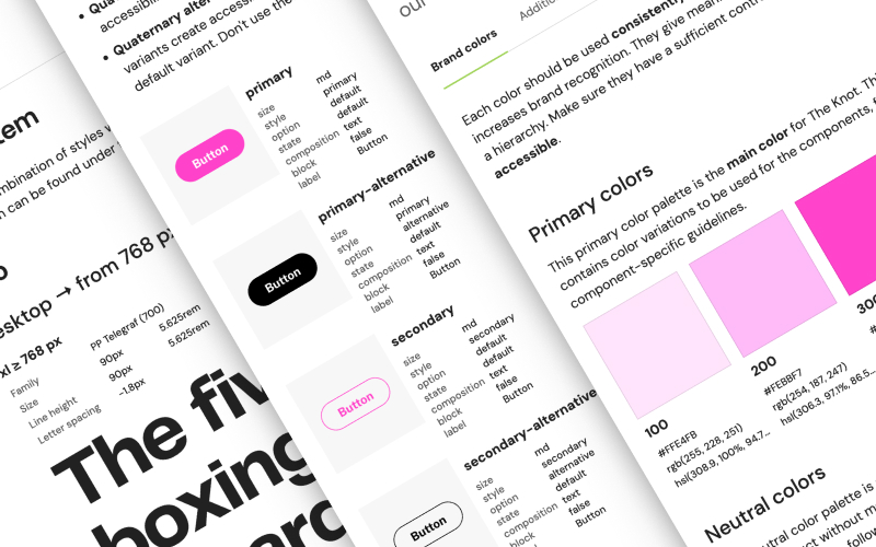
The system supports six brands across TKWW's portfolio, with The Knot and Hitched as the two most established in the system today. Each brand lives on the same architecture but expresses it differently. The semantic layer is where the system decouples brand identity from structural behaviour: sColor.text.brand maps to pColor.primary.400 for The Knot (#d700a0) but to pColor.primary.300 for Hitched (#775a97). Different values, same intent, same component.
The same cButton.primary component renders with a full-radius pill and magenta background on The Knot, and an 8px radius with purple on Hitched. No forking. No duplication. The component is identical; the tokens are what differ.
Platform strategy: Web and iOS
The system serves both Web and iOS from the same token base, while accommodating the structural differences each platform demands. 18 components are shared across both platforms. 10 are iOS-exclusive (TabBar, PillBar, NavigationBar, Toggle, StarsRating, DrawerPresentation...). 10 are web-exclusive (SubNav, SideNav, DatePicker, Carousel, Pagination, Breadcrumb...).
Platform deltas are documented and intentional. cButton.size.lg is 48px on web, 50px on iOS. cInput.height is 48px on web, 44px on iOS. cOverlay.opacity.dark is 70% on web (visual depth layer) vs 20% on iOS (native navigation convention). These are not inconsistencies; they are platform-appropriate decisions baked into the token structure, traceable from Figma to production.
Design to code pipeline
The pipeline enables a single change in Figma to propagate automatically across all four surfaces: The Knot Web, The Knot iOS, Hitched Web, and Hitched iOS.
Beyond the system
Owning a design system at this scale means owning its adoption, not just its components. I define how teams work with the system, what governance looks like, and how we manage change without disrupting teams that depend on stability. This includes frameworks for contribution, decision logs, and progressive rollout strategies that reduce friction and build trust.
As the bridge between design, engineering, and product, I translate architectural complexity into clear decisions and actionable guidance. The system only works if the people using it feel confident with it, so a significant part of the work is documentation, support, and building a culture where teams trust the system enough to contribute back to it.
What I learned
The real challenge with a design system is not building it, it is adoption. You can have the most well-structured token architecture in the world, and it means nothing if the teams consuming it don't trust it, don't understand it, or don't know how to contribute to it. Adoption is a product problem as much as a design one, and it requires the same kind of iteration and listening as any other.
Over time, as the company's strategy evolved and B1 became a core principle, the system's role shifted too. What started as a component library became a strategic foundation, and the way we built, communicated, and governed it had to evolve accordingly. The biggest learning has been staying close enough to the business to understand what the system actually needs to be, and being willing to change it, even when it means rethinking things that already work.